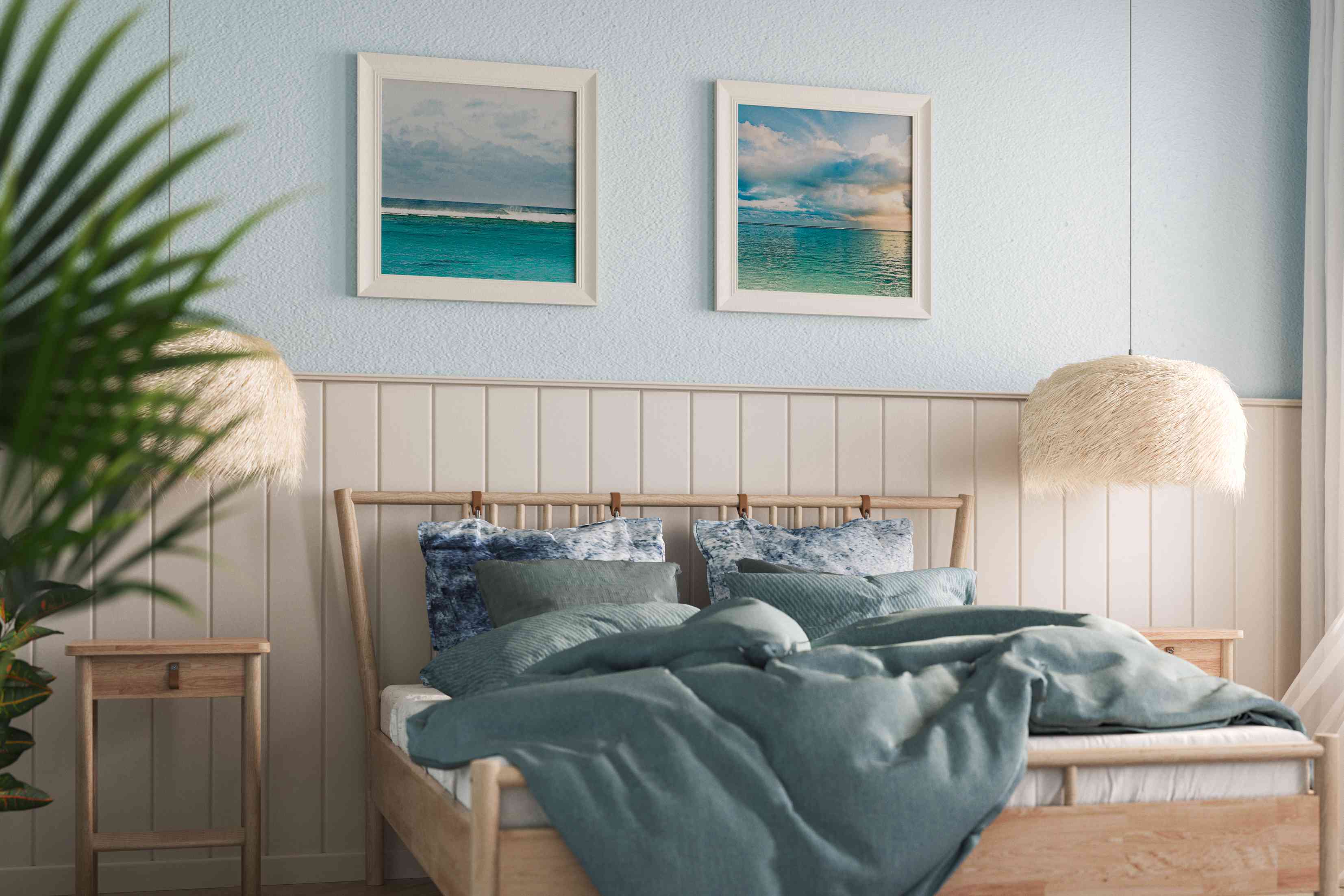
If there’s one room in your home where you want the mood to be “relaxed,” it’s your bedroom. And choosing a calming bedroom paint color will go a long way toward turning your room into a cozy spot to unwind—and hopefully, get a good night’s sleep.
There isn’t a single shade that works for every bedroom and every person, according to color design experts. But if you want to get started on the path to a more soothing bedroom, try these color-selection tips—and check out a few inspirational hues to get you started.
How to Choose a Calming Bedroom Paint Color
When selecting a soothing shade, designers have a few tried-and-true tricks. Follow these recommendations to select a calming paint color.
Think cool tones
The cooler colors are a natural choice for creating a calming environment. “Light and cool is a good rule of thumb, says Amy Krane, architectural color consultant at Amy Krane Color and host of the design podcast Let’s Talk Paint Color. “Calming colors are said to be cool ones, including blues, greens, and lavenders.”
Go for lighter shades than you think
People are oftentimes surprised at how light a paint color needs to be in order for it to not look too dark when it’s brushed on the wall, says Michelle Marceny, principal color designer at The Color Concierge. “Make sure that they aren’t too dark, so that they don’t become oppressive,” Marceny recommends when selecting deeper shades.
Consider neutrals
Those quiet luxury hues—soft neutrals—also guarantee a soothing bedroom style. “That would include pale neutrals—colors like off-whites, beiges, and pale grays, for instance,” Marceny says. You can also consider some neutral hues that aren’t pure white if you want something with a little more visual interest.
Change the intensity if you want to try bolder colors
Reds and oranges don’t exactly scream “relaxing”—and in fact, they can be screaming hot colors that won’t help you stay calm. But you don’t have to give them up entirely. Krane suggests moving a bit down the color spectrum to make a warmer color like red or orange work. You can tone down these hues by making them darker or grayer.
Another way to avoid an intense look? Use the color sparingly. A throw blanket on the bed or the inclusion of these colors in small amounts will add a bit of drama to an otherwise peaceful room and still keep the overall vibe low-key.
Consider your bedroom furnishings
Don’t just pick a color that you love—find a color that looks good with your bedroom decor. “Paint colors are usually the last element to pick,” Marceny says. “It’s much easier to find a color to match your decor than the other way around.”
Make sure you test it out in your space
Test out a sample in your space to see how it looks at different times of day. “Colors online are very inaccurate,” Krane says. “Go to the paint store and get a sample.”
Choose what you love
Both designers said that what’s relaxing can be a deeply personal choice, and you shouldn’t necessarily rely simply on colors that are labeled as “calming.” “Color psychology is a soft science, so adhering to its recommendations rigidly ignores an individual’s experiences, tastes, culture, physiology, and other factors,” says Krane. “That always takes precedence when deciding how to paint a room.”
11 Designer-Approved Calming Paint Colors for Your Bedroom
With thousands and thousands of colors out there, narrowing it down to the perfect serene shade can be a daunting task. These 11 expert-approved picks will give you the perfect launch point to find your ideal shade.
Cinnamon Slate by Benjamin Moore
Benjamin Moore
Marceny is considering this shade, Benjamin Moore’s 2025 pick for color of the year, for her own bedroom. “It’s soft, muted, and warm and pleasant. I personally like it as a dark wall color with white ceilings and trim, but you could also color drench it in a room.”
Skylight by Farrow & Ball
Farrow & Ball
Skylight, a pale sky blue, is one of Krane’s suggestions for a soft, calming palette for a bedroom. The touch of gray helps it stay on the more muted side.
Bricktone Red by Benjamin Moore
Benjamin Moore
If you want to go with a warmer shade, it’s best to keep it on the softer side, like this pick from Benjamin Moore. “Bricktone Red is an unusually soft, warm, elegant, and muted hue,” Marceny says.
Opal by Benjamin Moore
Benjamin Moore
Krane suggests Opal if you’re looking for a calming color on the more neutral side of the spectrum. This very soft off-white has warming notes of peach in its undertone.
Sea Salt by Sherwin-Williams
Sherwin-Williams
A touch of green lends a more natural vibe to this soft gray neutral color from Sherwin-Williams, recommending by Krane.
Nocturnal Gray by Benjamin Moore
Benjamin Moore
For people who want a bolder color for their bedroom, the gray undertones help soften this saturated blue-green from Benjamin Moore.
Rookwood Terracotta by Sherwin-Williams
Sherwin Williams
If you want to go for a warmer shade for your bedroom, this earthy terracotta tone is a perfect option, Marceny says.
Slate Teal by Benjamin Moore
Benjamin Moore
“Rich, beautiful, saturated colors can be so cozy in a bedroom,” Marceny says. “A great option is Benjamin Moore’s Slate Teal, one of my favorite darker rich teal paint colors.”
Carter Plum by Benjamin Moore
Benjamin Moore
Purples are a less-expected choice for a calming color, but both Krane and Marceny recommend it. If you’re looking for an off-the-beaten-path calming color for your bedroom, this deep violet is one of Krane’s top picks.
Bone China Blue by Little Greene
Little Greene
Krane recommends this soft, eggshell blue shade to give a calming and relaxing vibe to your bedroom.